Sunday, April 12, 2020

Sankey flow diagram

Many clinical trials collect prospective categorical data from participants to chart changes in the study population over time. Common examples would be quality of life questionnaires or risk scales, which provide a quick, standardized assessment of participant outcomes at a given time point.

A popular method for reporting prospective categorical data is to show results in a stacked bar chart. Consider the stacked bar chart below which reports number of risk factors participants exhibited at each of a series of visits.

sankey bar chart

This stacked bar chart is useful for quickly identifying trends in the overall study population - in this case, we can observe an increase in risk factors reported over time - but it does not provide much information about subgroups in the study. In the era of personalized and precision medicine, subgroup analysis is increasingly important for identifying which groups of people are most likely (or least likely) to respond to a particular treatment.

In our example above, we can see that there is a sizable increase in participants reporting 3 risk factors (dark green bar) from the 30-month visit to the 60-month visit. Where did these high-risk factor participants come from? We might assume they came from the group who had previously reported 2 or more risk factors, but the bar graph alone does not answer this question.

One solution is to overlay a Sankey flow diagram to the chart to shed some light on this mystery. Sankey diagrams were popularized by Matthew Henry Phineas Riall Sankey, a 19th-century Irish engineer, who created flow diagrams where the size of the arrow between two nodes is proportional to the magnitude of the flow.

With a Sankey Bar Chart, we can get the following visualization of our data:

sankey bar chart

Now we can see how our data flow between each time point, which helps us identify patterns in our data.  

Let's revisit our question from earlier.  Where did the 29% of high-risk factor participants at 60 months come from?  According to the diagram, some came from the groups reporting 2 and 3 risk factors at 12-months, but more than half came from the groups previously reporting 0 or 1 risk factor - not what we might have expected from just looking at the bar chart.  

For those wanting to really dive into their data, we can provide an interactive version allowing users to explore the chart by selecting individual bar sections or flows and isolating the data for those sections.

sankey bar chart

Like all good data visualizations, the Sankey bar chart is designed to communicate the story behind the data. The bar chart alone tells part of the story, but adding a Sankey overlay provides a richer and more detailed understanding of our data.

Mosaic or Mekko Charts

Mosaic or Mekko Charts

types of graphs - smartphone user mosaic or mekko chartBasic line, bar and pie charts are excellent tools for comparing one or two variables in few categories, but what happens when you need to compare multiple variables or multiple categories at the same time?


What if all those variables aren’t numeric even? A mosaic – or Mekko – chart plot might be the better choice.

Perhaps a market analyst, for example, wants to compare more than the size of various mobile-phone markets. What if, instead, he or she needs to compare the size of the user bases, as well as the age groups within each group?

A mosaic chart would allow said marketer to illustrate all the variables in a clear and straightforward manner.

In the above example, one axis of the chart represents the categories being compared – mobile phone manufacturers – while the other axis lists various age ranges.

The size and color of each cross-section of the chart corresponds with the market segment it represents, as depicted in the chart's legend.

Alternatives to pie chart

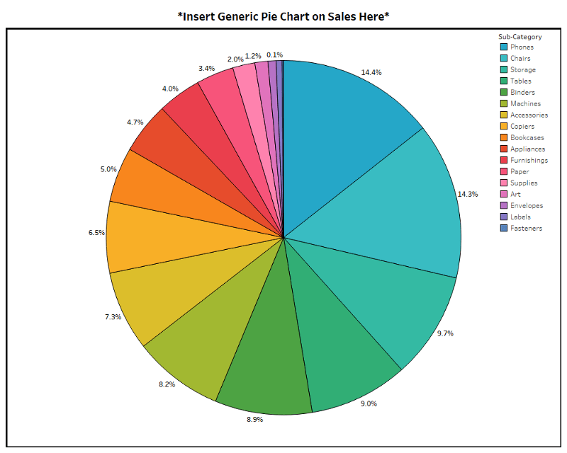
Every time I see a 3D pie chart made in Excel, I die a little on the inside.

Working in data visualization, you hear all sorts of opinions on pie charts. Some people really like them. Some people feel they should never be used. Mathematician John Tukey felt that there was no data displayed in a pie-chart that couldn’t be better displayed in another type of chart.

Unlike Tukey and design theorist Edward Tufte—who said, “The only worse design than a pie chart is several of them”—I am not of the opinion that pie charts should never be used. I just think they should be used less often.

I have sensed similar feelings toward Excel spreadsheets. They have even earned the nickname “walls of data.” The connection here is that pie charts and Excel spreadsheets are both overused and stretched to do things they were not meant to do. However, just like you wouldn’t remove colors from the painter’s palette and say, “No more green for you!” I don’t think the solution is to delete Excel and pie charts off everyone’s computer. Perhaps it’s more about making sure the painter has more colors to pick from.

Most of the existing content on this subject will direct you to use a bar chart or line chart instead. But I have challenged myself to show you five unusual alternatives to boring data visualization. Before you cook up another pie chart, consider these alternatives:

The dumbbell chart

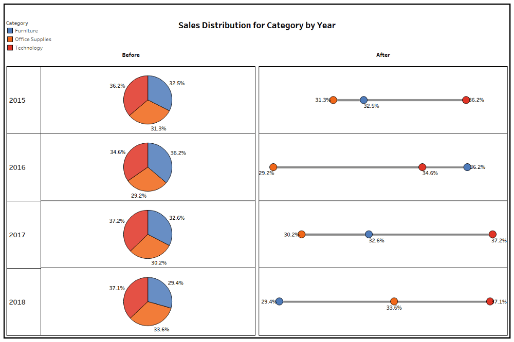
One of the most common abuses of pie charts is to use many of them together to display change over time or across categories. If the primary message you want to send to your viewer is variance, it’s helpful to know that humans are really good at detecting and valuing the distance between objects. The dumbbell chart, also known as the DNA chart, is a great way to show change by using visual lengths.

Technically this chart is a tri-bell rather than a dumbbell, but the point is that it gives the information some dimension.

From a visual perspective with the dumbbell/tri-bell presentation, it is easy to see that in 2018, furniture had a lower sales distribution than office supplies and technology. By contrast, the pies all look like peace signs and it is really hard to know both the rank across the categories and how they have changed year over year.

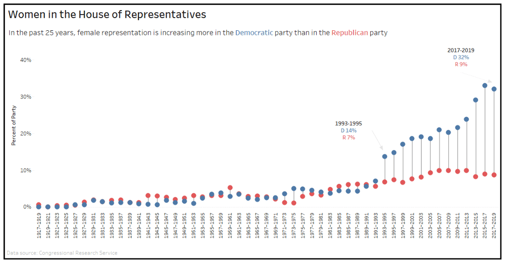
Here’s a great dumbbell chart example that reflects the increase of women in the House of Representatives as it relates to party:


Visualization by Katie Kilroy, with data from Congressional Research Service

The bump chart

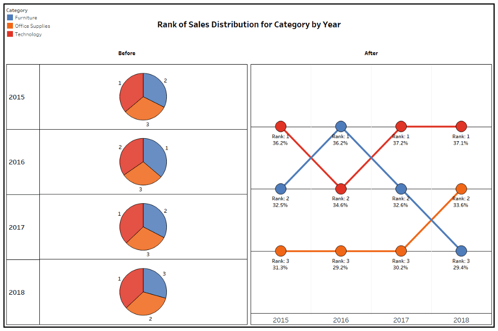
Variance may not be important to you. Maybe you want to show a ranking among the categories over time. Then I would point you to a special version of a line chart called the bump chart. Here’s the same information as in the previous example expressed a bit differently:

The greatest pro for the bump chart is that it’s really effective at visualizing ranks. But, for the cons, they can get noisy if ranks change a lot or if you have many categories. And like the dumbbell chart, viewers likely won’t realize you are comparing parts with the whole.

Here’s an effective bump chart example that displays the popularity ranks of new car colors and how they’ve changed over 16 years:


Visualization by Matt Chambers and inspired by Datagraver

The donut

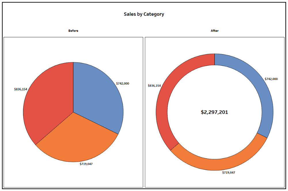
The first two suggestions are certainly different approaches to variance and ranking, but sometimes you need a simple way to convey the parts with the whole. It may be important for a viewer to quickly know that something adds up to 100 percent. And maybe you just like the shape of circles because they symbolize many good things, like the sun or wheels—or donuts.

In the example below, even though it’s the same shape as a pie chart, the donut conveys information a bit differently:

Because people are so overexposed to pie charts early and often throughout their lifetimes, there’s a key advantage in translating the info to a donut—it speeds up the time it takes the viewer to decode the parts and the whole of the visualization.

(On a side note, do you ever wonder if there is a correlation between people who like donut charts and stuffed-crust pizza? I do. Please send me that data set.)

The pros of a donut chart are that it’s effective at showing parts within a whole, but unlike a pie chart, it frees up white space at the core to throw in a total, call out a number, or add another data marker. It can also be used as a gauge to call out a single percentage.

The cons are that it’s hard to interpret things like variance and rank, and humans generally aren’t as good at registering the differences in the ring’s filled-in angle area as with other easy-comparison formats like bar charts.

It can be done, though. Here’s an example of a donut that is effective at using the ring’s shading to display salaries in proportion to each other:


Visualization by Ryan Sleeper with data from SeanLahman

The treemap

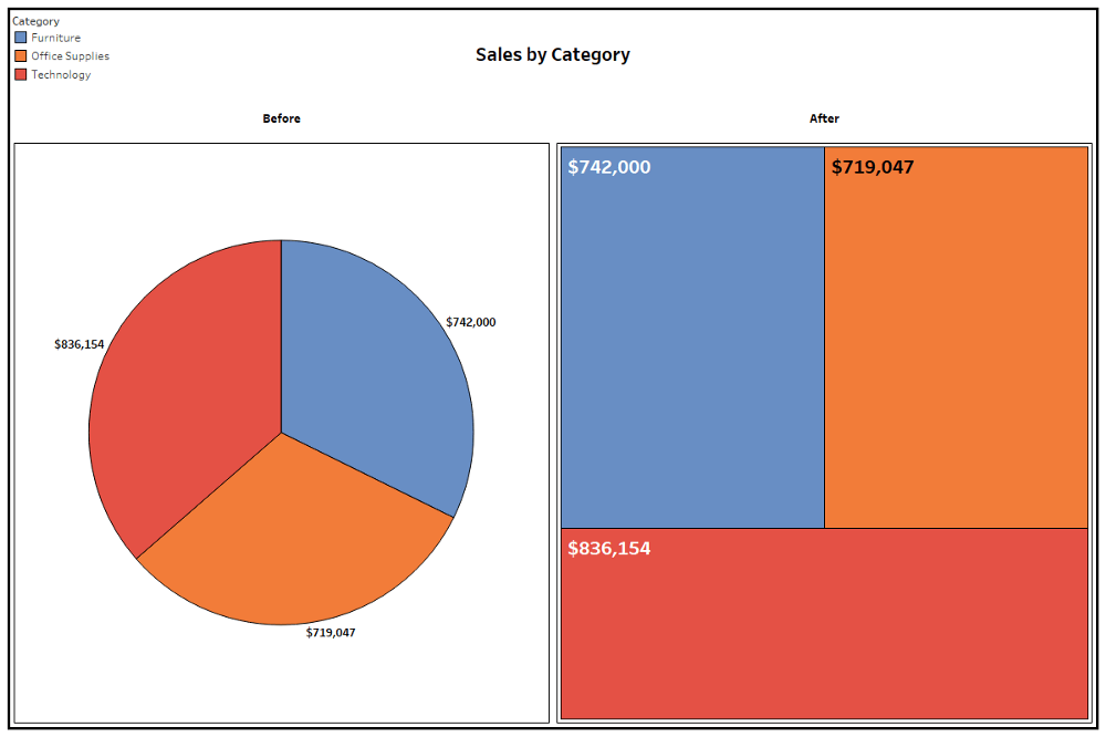
A primary argument against the pie chart is that humans are not good at detecting differences between angle sizes. Treemaps alleviate this by using area instead of angles to designate proportion. Using the same data as in the donut format above, this version uses sized rectangles:

In addition to the pro of displaying data with area space rather than angles, treemaps are more useful than pie charts when there are more than five categories (avoiding the sometimes hard-to-label pie slivers) and in visualizing subcategories within categories. The main con is that people are much less familiar with this format.

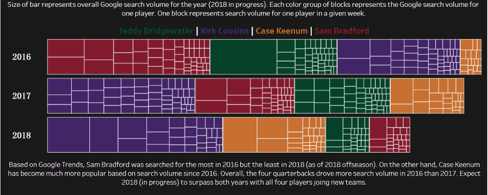
Here’s another treemap example that aims to show a lot of comparative information in its visualization of the weekly volume of Google searches of four football players across years:

The waffle chart

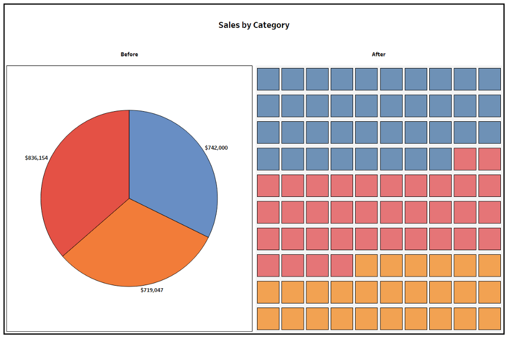
The waffle chart is a really fun chart and probably my favorite alternative to pie charts—and not just because it’s also named after food. Because it’s typically made with 100 squares representing the whole, it can be shaded or filled based on the relation of several parts to a whole, just like a pie chart—but it’s also good for displaying a single percentage.

The key pro is its diversity. It can show individual parts of a whole and compare single percentages, but another advantage—similar to treemaps—is that proportions are more clearly represented by area instead of angles.

The cons are that it becomes too complicated when too many segments are involved and the individualized spaces don’t leave a good spot to put numbers or much text within the visual itself.

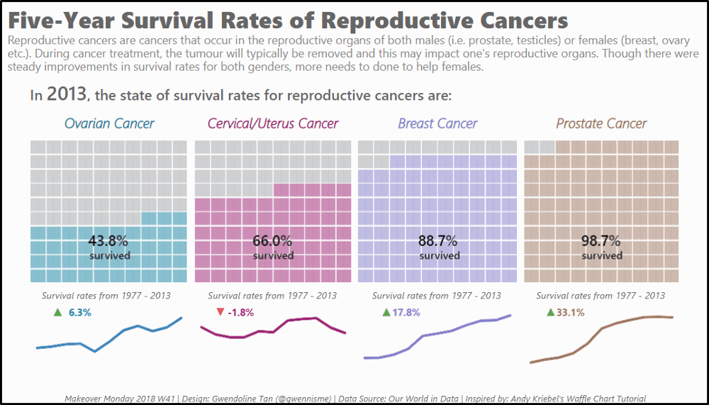
Here’s another waffle chart example that neatly displays comparative survival rates for types of cancers:


Visualization by Gwendoline Tan with data from Our World in Data

Other alternatives

These are only a handful of diverse and creative ways you can visualize data. I also considered other unusual diagram alternatives: Marimekko charts, Sankey flow diagrams, radial pie charts, and sunburst charts.

Let me just leave you with one last 3D pie chart:

Treemap

What is a Treemap?


Treemaps are ideal for displaying large amounts of hierarchically structured (tree-structured) data. The space in the visualization is split up into rectangles that are sized and ordered by a quantitative variable.

The levels in the hierarchy of the treemap are visualized as rectangles containing other rectangles. Each set of rectangles on the same level in the hierarchy represents a column or an expression in a data table. Each individual rectangle on a level in the hierarchy represents a category in a column. For example, a rectangle representing a continent may contain several rectangles representing countries in that continent. Each rectangle representing a country may in turn contain rectangles representing cities in these countries. You can create a treemap hierarchy directly in the visualization, or use an already defined hierarchy.

A number of different algorithms can be used to determine how the rectangles in a treemap should be sized and ordered. The treemap in Spotfire uses a squarified algorithm.

The rectangles in the treemap range in size from the top left corner of the visualization to the bottom right corner, with the largest rectangle positioned in the top left corner and the smallest rectangle in the bottom right corner. For hierarchies, that is, when the rectangles are nested, the same ordering of the rectangles is repeated for each rectangle in the treemap. This means that the size, and thereby also position, of a rectangle that contains other rectangles is decided by the sum of the areas of the contained rectangles.


Example:

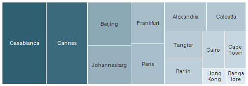
Below is a treemap where the rectangles represent cities and are sized and colored by the column Sales. In this case, the aggregation method Sum was selected for the Sales column. This treemap only contains data on one level.

tree_example_one_level.png


The sizes and positions of the rectangles, as well as the coloring, indicate that Casablanca and Cannes have the highest total sum of sales, while Hong Kong and Bangalore have the lowest.

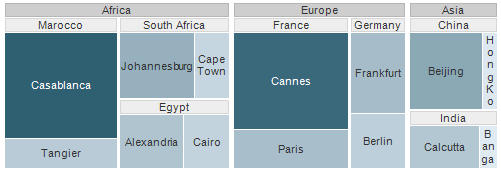
To compare sum of sales for entire countries or continents, you can add other levels to the treemap hierarchy without losing the information about the individual cities. In the treemap below, the columns Country and Continent were added to the treemap hierarchy.

tree_example_three_levels.png

The rectangles are now nested. Each rectangle that represents a continent consists of rectangles representing countries within that continent. Each rectangle that represents a country consists of rectangles representing cities in that country. It is still possible to see which individual cities has the highest sum of sales, but it is now also easy to see that Africa is the continent with the highest total sum of sales, and that Asia is the continent with the lowest total sum of sales. Since the rectangles are now nested, the rectangles are not in the same positions anymore. However, each level of the hierarchy is still organized according to the squarified algorithm. For example, the size of the rectangle representing India is decided by the sum of the areas of the two rectangles representing Calcutta and Bangalore. The size of the rectangle representing Asia is in turn decided by the sum of the areas of the rectangles representing China and India.


Tuesday, December 24, 2019

Gini coefficient and Lorenz curve

Tuesday, October 8, 2019

ANOVA

ANOVA is a general technique that can be used to test the hypothesis that the means among two or more groups are equal, under the assumption that the sampled populations are normally distributed.
Suppose we wish to  study the effect of temperature on a passive component such as a resistor. We select three different temperatures and observe their effect on the resistors. This experiment can be conducted by measuring all the participating resistors before placing resistors each in three different ovens. Each oven is heated to a selected temperature. Then we measure the resistors again after, say, 24 hours and analyse the responses, which are the differences between before and after being subjected to the temperatures. The temperature is called a factor. The different temperature settings are called levels. In this example there are three levels or settings of the factor Temperature.
A factor is an independent treatment variable whose settings (values) are controlled and varied by the experimenter. The intensity setting of a factor is the level. Levels may be quantitative numbers or, in many cases, simply “present” or “not present” (“0” or “1”). For example, the temperature setting in the resistor experiment may be:100 degree F, 200 degree F and 300 degree F. We can simply call them: Level1, Level 2 and Level 3
The 1-way ANOVA
In the experiment above, there is only one factor, temperature, and the analysis of variance that we will be using to analyse the effect of temperature is called a one-way or one-factor ANOVA.
The 2-way or 3-way ANOVA
We could have opted to also study the effect of positions in the oven. In this case there would be two factors, temperature and oven position. Here we speak of a two-way or two-factor ANOVA. Furthermore, we may be interested in a third factor, the effect of time. Now we deal with a three-way or three-factor ANOVA. In each of these ANOVA’s we test a variety of hypotheses of equality of means (or average responses when the factors are varied).
ANOVA is defined as a technique where the total variation present in the data is portioned into two or more components having specific source of variation. In the analysis, it is possible to attain the contribution of each of these sources of variation to the total variation. It is designed to test whether the means of more than two quantitative populations are equal. It consists of classifying and cross-classifying statistical results and helps in determining whether the given classifications are important in affecting the results.
The assumptions in analysis of variance are:
Normality
Homogeneity
Independence of error
Whenever any of these assumptions is not met, the analysis of variance technique cannot be employed to yield valid inferences.
With analysis of variance, the variations in response measurement are partitioned into components that reflect the effects of one or more independent variables. The variability of a set of measurements is proportional to the sum of squares of deviations used to calculate the variance:
Σ(X-x ̅)2
Analysis of variance partitions the sum of squares of deviations of individual measurements from the grand mean (called the total sum of squares) into parts: the sum of squares of treatment means plus a remainder which is termed the experimental or random error.
When an experimental variable is highly related to the  response, its part of the total sum of the squares will be highly inflated.
This condition is confirmed by comparing the variable sum of squares with that of the
random error sum of squares using an F test.
Why use Anova and Not Use t-test Repeatedly?
The t-test, which is based on the standard error of the difference between two means, can only be used to test differences between two means
With more than two means, could compare each mean with each other mean using t tests
Conducting multiple t-tests can lead to severe inflation of the Type I error rate (false positives) and is NOT RECOMMENDED.
ANOVA is used to test for differences among several means without increasing the Type I error rate
The ANOVA uses data from all groups to estimate standard errors, which can increase the power of the analysis
Why Look at Variance When Interested in Means?

Three groups tightly spread about their respective means, the variability within each group is relatively small
Easy to see that there is a difference between the means of the three groups

Three groups have the same means as in previous figure but the variability within each group is much larger
Not so easy to see that there is a difference between the means of the three groups
To distinguish between the groups, the variability between (or among) the groups must be greater than the variability of, or within, the groups
If the within-groups variability is large compared with the between-groups variability, any difference between the groups is difficult to detect
To determine whether or not the group means are significantly different, the variability between groups and the variability within groups are compared
One-Way ANOVA
Suppose there are k populations which are from a normal distribution with unknown parameters. A random sample X1, X2, X3……………… Xk is taken from these populations
which hold the assumptions. If μ1, μ2, μ3………… μk are k population means, the null hypothesis is:
H0 : μ1 = μ2 = μ3………… = μk (i.e. all means are equal)
HA : μ1 ≠ μ2 ≠ μ3………… ≠ μk  (i.e. all means are not equal)
The steps in carrying out the analysis are:
Calculate variance between the samples
The variance between samples measures the difference between the sample mean of each group and the overall mean. It also measures the difference from one group to another. The sum of squares between the samples is denoted by SSB. For calculating variance between the samples, take the total of the square of the deviations of the means of various samples from the grand average and divide this total by the degree of freedom, k-1 , where k = no. of samples.
Calculate variance within samples
The variance within samples measures the inter-sample or within sample differences due to chance only. It also measures the variability around the mean of each group. The sum of squares within the samples is denoted by SSW. For calculating variance within the samples, take the total sum of squares of the deviation of various items from the mean values of the respective samples and divide this total by the degree of freedom, n-k, where n = total number of all the observations and k = number of samples.
Calculate the total variance
The total variance measures the overall variation in the sample mean. The total sum of squares of variation is denoted by SST. The total variation is calculated by taking the squared deviation of each item from the grand average and dividing this total by the degree of freedom, n-1 where n = total number of observations.
Calculate the F ratio
It measures the ratio of between–column variance and within-column variance. If there is a real difference between the groups, the variance between groups will be significantly larger than the variance within the groups.
F = ( Variance between the Groups ) / Variance within the Groups
F = SSB / SSW
Decision Rule
At a given level of significance E =0.05 and at n-k and k-1 degrees of freedom, the value of F is tabulated from the table. On comparing the values, if the calculated value is greater than the tabulated value, reject the null hypothesis. That means the test is significant or there is a significant difference between the sample means.
Applicability of ANOVA
Analysis of variance has wide applicability from experiments. It is used for two different purposes:
It is used to estimate and test hypothesis about population means.
It is used to estimate and test hypothesis about population variances.
An analysis of variance to detect a difference in three or more population means first requires obtaining some summary statistics for calculating variance of a set of data as shown below:              Where:
Σx2 is called the crude sum of squares
(Σx)2 / N is the CM (correction for the mean), or CF (correction factor)
Σx2 – (Σx)2 / N is termed SS (total sum of squares, or corrected SS).
σ2(variance)=(Total sum of squares)/(Total DF (Degrees of freedom))=(∑▒〖x^2-(〖∑▒x)〗^2/N〗)/(N-1)
In the one-way ANOVA, the total variation in the data has two parts: the variation among treatment means and the variation within treatments.
The  grand average GM = Σx/N
The total SS (Total SS) is then:
Total SS = Σ(Xi – GM)2 Where Xi is any individual measurement.
Total SS = SST + SSE Where SST = treatment sum of squares and SSE is the experimental error sum of squares.
Sum of the squared deviations of each treatment average from the grand average or grand mean.
Sum of the squared deviations of each individual observation within a treatment from the treatment average. For the ANOVA calculations:
Total Treatment CM  Σ(TCM)= 
SST = Σ(TCM) – CM
SSE = Total SS – SST (Always obtained by difference)
Total DF = N – 1 (Total Degrees of Freedom)
TDF = K – 1 (Treatment DF = Number of treatments minus 1)
EDF = (N – 1) – (K – 1) = N – K (Error DF, always obtained by difference)
MST =SST/TFD=SST/(K-1) (Mean Square Treatments)
MSE = SSE/EDF=SSE/(N-K)  (Mean Square Error)To test the null hypothesis:
H0 : μ1 = μ2 = μ3………… = μk            H1 : At least one mean different
F = MST/MSE         When F > Fα , reject H0The overall mean is
Two-Way ANOVA
It will be seen that the two-way analysis procedure is an extension of the patterns described in the one-way analysis. Recall that a one-way ANOVA has two components of variance: Treatments and experimental error (may be referred to as columns and error or rows and error). In the two-way ANOVA there are three components of variance: Factor A treatments, Factor B treatments, and experimental error (may be referred to as columns, rows, and error).
In a two way analysis of variance, the treatments constitute different levels affected by more than one factor. For example, sales of car parts, in addition to being affected by the point of sale display, might also be affected by the price charged, the location of store and the number of competitive products. When two independent factors have an effect on the dependent factor, analysis of variance can be used to test for the effects of two factors simultaneously. Two sets of hypothesis are tested with the same data at the same time.
Suppose there are k populations which are from normal distribution with unknown parameters. A random sample X1, X2, X3……………… Xk is taken from these populations which hold the assumptions. The null hypothesis for this is that all population means are equal against the alternative that the members of at least one pair are not equal. The hypothesis follows:
H0 : μ1 = μ2 = μ3………… = μk
HA : Not all means μj are Equal.
If the population means are equal, each population effect is equal to zero against the alternatives. The test hypothesis is
H0 : β1 = β2 = β3………… = βk
HA : Not all means βj are Equal.
Calculate variance between the rows
The variance between rows measures the difference between the sample mean of each row and the overall mean. It also measures the difference from one row to another. The sum of squares between the rows is denoted by SSR. For calculating variance between the rows, take the total of the square of the deviations of the means of various sample rows from the grand average and divide this total by the degree of freedom, r-1 , where r= no. of rows.
Calculate variance between the columns
The variance between columns measures the difference between the sample mean of each column and the overall mean. It also measures the difference from one column to another. The sum of squares between the columns is denoted by SSC. For calculating variance between the columns, take the total of the square of the
deviations of the means of various sample columns from the grand average and divide this total by the degree of freedom, c-1 , where c= no. of columns.
Calculate the total variance
The total variance measures the overall variation in the sample mean.The total sum of squares of variation is denoted by SST. The Total variation is calculated by taking the squared deviation of each item from the grand average and divide this total by degree of freedom, n-1 where n= total number of observations.
Calculate the variance due to error
The variance due to error or Residual Variance in the experiment is by chance variation. It occurs when there is some error in taking observations, or making calculations or sometimes due to lack of information about the data. The sum of squares due to error is denoted by SSE. It is calculated as:
Error Sum of Squares = Total Sum of Squares – Sum of Squares between Columns – Sum of Squares between Rows.
The degree of freedom in this case will be (c-1)(r-1).
Calculate the F Ratio
It measures the ratio of between–column variance and within-row variance with variance due to error.
F = Variance between the Columns / Variance due to Error
F = SSC / SSE
F = Variance between the Rows / Variance due to Error
F = SSR / SSE
Decision Rule At a given level of significance α=0.05 and at n-k and k-1 degrees of freedom, the value of F is tabulated from the table. On comparing the values, if the calculated value is greater than the tabulated value, reject the null hypothesis. This means that the test is significant or, there is a significant difference between the sample means.


ANOVA Table for an A x B Factorial Experiment
In a factorial experiment involving factor A at a levels and factor B at b levels, the total sum of squares can be partitioned into:
Total SS = SS(A) + SS(B) + SS(AB) + SSE
ANOVA Table for a Randomized Block Design
The randomized block design implies the presence of two independent variables, blocks and treatments. The total sum of squares of the response measurements can be partitioned into three parts, the sum of the squares for the blocks, treatments, and error. The analysis of a randomized block design is of less complexity than an A x B factorial experiment.
Goodness-of-Fit Tests
GOF (goodness-of-fit) tests are part of a class of procedures that are structured in cells. In each cell there is an observed frequency, (Fo). From the nature of the problem, one either knows the expected or theoretical frequency, (Fe) or can calculate it. Chi square (χ2) is then summed across all cells according to the  formula:
The calculated chi square is then compared to the chi square critical value for the following appropriate degrees of freedom: 

Wednesday, August 14, 2019

Public Private Partnership

Tuesday, August 13, 2019

Least square mean

Least squares means (marginal means) vs. means Least square means is actually referred to as marginal means. In an analysis of covariance model, they are the group means after having controlled for a covariate (i.e. holding it constant at some typical value of the covariate, such as its mean value).
I made up the data in Table 1 above. There are two treatment groups (treatment A and treatment B) that are measured at two centers (Center 1 and Center 2). The mean value for Treatment A is simply the summation of all measures divided by the total number of observations (Mean for treatment A = 24/5 = 4.8); similarly the Mean for treatment B = 26/5 = 5.2. Mean for treatmeng A > Mean for treatment B. Table 2 shows the calculation of least squares means. First step is to calculate the means for each cell of treatment and center combination. The mean 9/3=3 for treatment A and center 1 combination; 7.5 for treatment A and center 2 combination; 5.5 for treatment B and center 1 combination; and 5 for treatment B and center 2 combination. After the mean for each cell is calculated, the least squares means are simply the average of these means. For treatment A, the LS mean is (3+7.5)/2 = 5.25; for treatment B, it is (5.5+5)/2=5.25. The LS Mean for both treatment groups are identical. It is easy to show the simple calculation of means and LS means in the above table with two factors. In clinical trials, the statistical model often needs to be adjusted for multiple factors including both categorical (treatment, center, gender) and continuous covariates (baseline measures). The calculation of LS mean is not easy to demonstrate. However, the LS mean should be used when the inferential comparison needs to be made. Typically, the means and LS means should point to the same direction (while with different values) for treatment comparison. Occasionally, they could point to the different directions (treatment A better than treatment B according to mean values; treatment B better than treatment A according to LS Mean).

Wednesday, January 2, 2019

Which statistical test to apply


Some names of the statistical tests:

Ref. Dtsch Arztebl Int 2010; 107(19): 343–8 DOI: 10.3238/arztebl.2010.0343

Edit:error in the picture
Mann Whitney U test is same as wilxon rank sum test 
Wilcoxon Signed rank test is done in paired data
Ref. Dtsch Arztebl Int 2010; 107(19): 343–8 DOI: 10.3238/arztebl.2010.0343
Creative Commons License
PSM / COMMUNITY MEDICINE by Dr Abhishek Jaiswal is licensed under a Creative Commons Attribution-NonCommercial-ShareAlike 4.0 International License.
Based on a work at learnpsm@blogspot.com.
Permissions beyond the scope of this license may be available at jaiswal.fph@gmail.com.

Minimisation


The most important drawback of the randomization software is the problem of unmatched groups. In the process of randomization it is probable that the treatment groups develop significant differences in some prognostic factors, especially when the sample size is relatively small (<200). If these factors have important effects on the primary or secondary outcomes of the study, any important difference in the levels of these factors invalidate the trial results, and necessitate complicated statistical analysis with unreliable results. Various methods have been used to overcome the problem of unmatched trial groups including minimization and stratification, with minimization providing more acceptable results. With minimization the first subjects are enrolled randomly into one of groups. The subsequent subjects will be allocated to treatment groups after hypothetical allocation of each subject to every group, and then calculating an imbalance score. Using these imbalance scores, we can decide to which group the new subject must be allocated, to have the minimum amount of imbalance, in terms of prognostic factors. Pure minimization is indeed completely deterministic, that is, we can predict which group the next subject will be enrolled in, provided the factor levels of the new subject are known. This may invalidate the principle of trial blindness and introduce some bias into the trial. To overcome this shortcoming some elements of randomness are incorporated into the minimization algorithm, to make the prediction unlikely. Unfortunately the whole process of minimization is well beyond the skill of a typical clinical researcher, especially when the problem of unequal group allocations has to be taken into account. The difficulty in computation has resulted in a relatively less frequent use of minimization methods, in randomized clinical trials. The computer software can perform excellently in these situations, especially when the implementation has been logical. In the following sections, the aspects of two minimization programs are presented. Again the selection of these programs is based on the availability and ease of use.

Creative Commons License
PSM / COMMUNITY MEDICINE by Dr Abhishek Jaiswal is licensed under a Creative Commons Attribution-NonCommercial-ShareAlike 4.0 International License.
Based on a work at learnpsm@blogspot.com.
Permissions beyond the scope of this license may be available at jaiswal.fph@gmail.com.